Color Management in Packaging Paper Printing: Why Color Consistency Matters More Than Most Buyers Realize
When customers review custom printed packaging paper, the first thing they usually notice is color. Not the paper weight. Not the printing method. Not the production process. Color. In fact, some of the most detailed discussions we have before production involve a single question: 'Can you match our brand color exactly?' It's a reasonable question, especially for brands that invest heavily in visual identity. However, after working on wrapping paper, tissue paper, gift paper, and packaging paper projects, we've learned that color management is often more complex than buyers initially expect. Color is not simply selected and printed. Maintaining color consistency from sample approval to mass production requires planning, communication, and production control.
TL;DR
When customers review custom printed packaging paper, the first thing they usually notice is color. Not the paper weight.
Why Color Is So Important In Packaging
For many brands, packaging is one of the most visible parts of the customer experience. Customers often recognize a brand through logo colors, packaging colors, store displays, and marketing materials. When packaging colors vary significantly, branding can feel inconsistent. This is particularly important for retail brands, cosmetics companies, fashion brands, gift packaging programs, and subscription box businesses.
The larger the packaging program becomes, the more important color consistency tends to be.
The Most Common Misunderstanding About Color
One misconception we encounter frequently is: 'The color on my screen is the color that will be printed.' Unfortunately, packaging printing doesn't work that way. Computer screens display light. Printed packaging uses ink on paper. These are completely different environments.
A design that looks perfect on a monitor may appear slightly different when printed on actual packaging paper. This is one reason physical sample approval remains such an important step.
Why Paper Material Affects Color
Many buyers focus entirely on artwork. Factories also focus on the paper itself. The exact same design can produce different visual results depending on whether it is printed on white tissue paper, colored tissue paper, white kraft paper, brown kraft paper, or wrapping paper. The paper influences how colors appear after printing.
Because of this, color discussions should always happen alongside material discussions. Evaluating one without the other often leads to misunderstandings.
A Situation We See Regularly
A customer approves artwork based on a digital file. Production samples are prepared. The customer notices the color looks slightly different than expected. The first reaction is often 'The color changed.' In many cases, the color did not change significantly.
What changed was the environment. The customer is now seeing real paper, real ink, and real lighting conditions rather than a digital display. This is why sample approval helps create realistic expectations before production begins.
Why Brand Colors Require Extra Attention
Some projects place greater demands on color accuracy than others. For example: cosmetics packaging — brand consistency is often very important. Fashion packaging — colors frequently need to align across multiple packaging materials. Luxury gift packaging — visual presentation is often a major priority.
Retail packaging programs — repeat-order consistency becomes increasingly important. In these situations, color management usually becomes a major part of the production planning process.
Color Consistency Becomes More Important Over Time
First orders are important. Repeat orders are where color management really proves its value. Most long-term customers don't just want good color today. They want the same color six months later, next season, and on future orders.
This is one reason experienced buyers often discuss color references and sample approvals in great detail. Consistency matters more than achieving a perfect result one time.
Why Tissue Paper Creates Unique Color Challenges
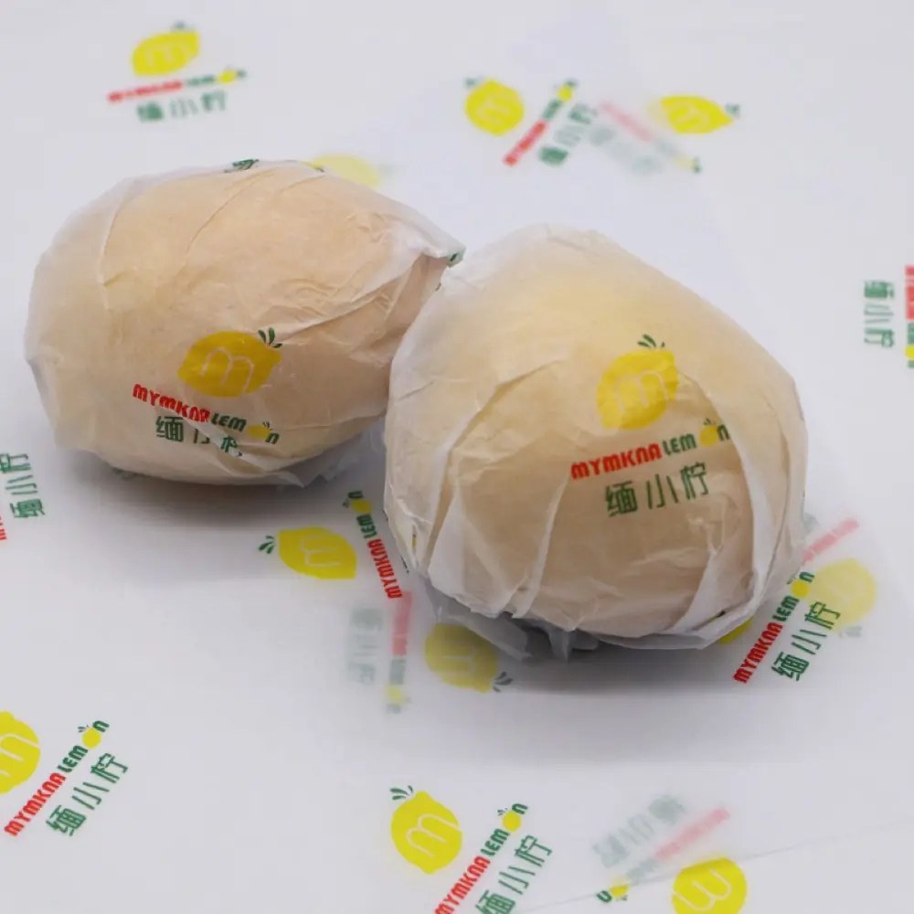
Tissue paper behaves differently from many other packaging materials. Because tissue paper is thin and lightweight, ink appearance may vary more visibly, transparency affects perception, and large solid-color areas require additional attention. We often recommend spending extra time reviewing tissue paper samples because color expectations can differ significantly from heavier paper grades.
The Role Of Production Samples
Some customers see sampling as an extra step. From a factory perspective, it's often one of the most important stages of the project. Production samples help verify color appearance — how colors actually look on the selected paper. They also check design visibility, material compatibility, and whether both sides are aligned before mass production begins.
Many potential issues are easier to solve during sampling than during production.
What Experienced Buyers Usually Do
Experienced packaging buyers rarely approve colors using digital files alone. They typically request physical samples, review samples under normal lighting, compare packaging materials side by side, and save approved references for repeat orders. These habits help reduce future inconsistencies. Over time, they contribute to more stable packaging programs.
Common Color Management Mistakes
In working with buyers, we've observed several recurring color management mistakes.
Using Screens As The Only Reference - Digital displays should not be the final color approval tool.
Changing Materials Late In The Project - Material changes can influence color appearance.
Skipping Production Samples - Physical samples often reveal details that digital files cannot.
Treating First Orders And Repeat Orders The Same - Long-term color consistency requires planning from the beginning.
What We Have Learned From Packaging Projects
One lesson appears repeatedly. Customers rarely complain because a color is slightly lighter or darker. Most concerns appear when colors are inconsistent between orders. That distinction is important.
Strong color management is often less about achieving perfection and more about maintaining predictability. Brands value packaging they can trust.
Our Approach At Wise Packaging
At Wise Packaging, color discussions start long before production begins. For custom wrapping paper, tissue paper, and packaging paper projects, we typically discuss brand color expectations, paper selection, printing requirements, sample approvals, and repeat-order consistency. By addressing these topics early, we can help reduce surprises later in production. In our experience, successful color management depends as much on communication as it does on printing technology.
Color management is one of the most important aspects of packaging paper printing, yet it is often underestimated during the early stages of a project. The most successful packaging programs recognize that color consistency is not achieved through artwork alone. It requires coordination between design, material selection, sample approval, and production control. For brands investing in custom packaging, strong color management helps ensure that customers see the same brand experience every time they open a package.
Frequently Asked Questions
Why does my printed packaging color look different from my computer screen?
Screens display light, while packaging is printed with ink on paper. These different environments can affect color appearance.
Does paper type affect printed colors?
Yes. Different paper materials can influence how colors appear after printing.
Why are production samples important?
Samples provide a realistic representation of color, design, and paper performance before mass production begins.
Is color consistency important for repeat orders?
Yes. Many brands prioritize consistency across multiple production runs and packaging programs.
Why is tissue paper more challenging for color management?
Its lightweight structure and transparency can make color variations more noticeable.
What is the biggest color management mistake buyers make?
Relying solely on digital artwork and screen colors instead of reviewing physical production samples.
Exploring certified or sustainable paper?
Understand what each certification actually covers before you specify it — our FSC guide breaks it down.
Sales Manager at WiseInco · 15+ years in packaging paper industry
Helping global brands source FSC-certified gift wrapping, tissue, kraft, and greaseproof paper from our 50,000 m² factory in Dongguan, China. 5,000+ containers exported to 30+ countries annually.