How to Reduce Color Differences in Custom Printed Wrapping Paper: A Factory Guide for Packaging Buyers
"Will the printed color match our brand color exactly?" It's the question we hear most often from first-time buyers, and it's a fair one. For brands that invest heavily in visual identity — luxury packaging, retail gift wrap, cosmetics, seasonal promotions — even a half-shade off can throw the whole presentation. As a custom wrapping paper manufacturer who's guided hundreds of print projects through production, we've seen firsthand where color variation comes from and what buyers can realistically control. This guide explains the most common pitfalls and how to avoid them before your order hits the press.
TL;DR
"Will the printed color match our brand color exactly?" It's the question we hear most often from first-time buyers, and it's a fair one. For brands that invest heavily in visual identity — luxury packaging, retail gift wrap, cosmetics, seasonal promotions — even a half-shade off can throw the whole presentation.
Why Color Differences Happen in Paper Printing
Many customers assume printing works like displaying a digital image on a computer screen. In reality, printing and digital displays are completely different systems. A logo shown on a laptop, a mobile phone, or a tablet may already appear slightly different before production even begins. When that artwork is transferred onto paper using industrial printing equipment, additional variables enter the process — paper material, ink formulation, press settings, drying conditions, and lighting environments.
Because of these factors, no professional manufacturer can guarantee that every printed sheet will be 100% identical to a digital screen. What manufacturers focus on is maintaining color consistency within acceptable industry tolerances.
Paper Type Has a Bigger Impact Than Most Buyers Realize
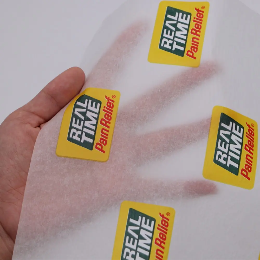
One mistake many first-time buyers make is focusing only on artwork. In reality, paper selection often influences color appearance more than the design itself. Coated paper reflects more light, producing colors that appear brighter, sharper, and more vibrant — this material is often used for premium gift wrapping paper. Kraft paper has a natural brown base.
Even when using the same ink formula, colors appear warmer, softer, and more muted. This is normal — many customers specifically choose kraft paper because of this natural look. Tissue paper behaves differently again because of its lightweight structure. Ink absorption is usually higher, which may affect color strength.
Experienced manufacturers normally adjust printing settings based on the paper type being used.
Paper Type
Typical GSM
Color Result
Best Application
Coated Paper
60–90 gsm
Bright, vibrant, high contrast
Premium gift wrap, luxury retail
Kraft Paper
50–80 gsm
Warm, muted, earthy tones
Eco-friendly, rustic, minimalist
Tissue Paper
17–40 gsm
Soft, absorbs ink (lighter colors)
Gift stuffing, garment, food wrap
Pantone Colors vs CMYK Printing
Another topic that frequently causes confusion is color standards. Most packaging buyers will eventually encounter two terms. Pantone Colors (PMS) use pre-mixed inks, offering higher consistency, better brand color accuracy, and easier reproduction across different production runs. For luxury brands and large retailers, Pantone matching is often requested.
CMYK printing uses four process colors — Cyan, Magenta, Yellow, and Black — offering lower cost, flexible image reproduction, and suitability for complex artwork. Many wrapping paper projects use CMYK because of its efficiency. However, certain brand colors can be more difficult to reproduce exactly using CMYK alone.
Feature
Pantone (PMS)
CMYK
Color Accuracy
Excellent (Delta E < 2.0)
Good (Delta E 2.0–4.0)
Production Cost
Higher
Lower
Color Range
1,867 solid colors
Millions via process mix
Best For
Brand logos, corporate colors
Photos, complex art, gradients
Batch Consistency
Very high
Good with calibration
Why Physical Samples Matter
One recommendation we give nearly every customer: approve a physical sample whenever possible. Many problems can be avoided before mass production begins. A production sample allows customers to evaluate colors, paper texture, print quality, and overall appearance under real-world conditions. On-screen approvals are useful, but they cannot fully represent how the finished paper will look.
For large-volume orders, sampling is one of the most important steps in the process.
Lighting Can Change the Appearance of Printed Paper
This is something many buyers don't discover until after production. A wrapping paper design can look different under factory lighting, office lighting, retail store lighting, or sunlight. The actual ink may be identical, but the perceived color can change. When evaluating samples, manufacturers and customers should ideally review them under similar lighting conditions to avoid surprises.
How Professional Factories Control Color Consistency
At a factory level, color management starts before printing and continues throughout production. Typical quality control procedures include standardized ink mixing — each color is mixed according to defined specifications. Press calibration — printing equipment is adjusted before production begins. Production monitoring — operators compare production output against approved references during the run.
Final inspection — finished products are checked before packing and shipment. These procedures help reduce variation and improve consistency across large production volumes.
At Wise Packaging, we've printed jobs where the client's Pantone 342 Green needed to match their global packaging across corrugated boxes, hang tags, and gift wrap — each on different substrates. Our spectrophotometer-based ink mixing and inline color monitoring kept the Delta E under 2.0 across all 3 materials, which is well within printing industry tolerance.
Questions Buyers Should Ask Before Ordering
Before confirming a custom printed wrapping paper order, buyers should ask suppliers: Can you provide a printed sample? Do you support Pantone color matching? Which paper material do you recommend? How do you control color consistency?
Have you produced similar projects before? The answers often reveal how much experience a supplier has with custom packaging projects.
Common Expectations That Cause Problems
In our experience, most color disputes come from unrealistic expectations rather than manufacturing issues. Expectation #1: "The printed paper must look exactly like my computer screen." In reality, screens and printed materials reproduce colors differently. Expectation #2: "If the artwork is the same, every paper type should look identical." Different paper surfaces affect ink performance differently. Expectation #3: "Large production runs should have zero variation." Industrial printing tolerances always exist.
Professional factories focus on keeping variation within acceptable quality standards.
What We Recommend to Packaging Buyers
For businesses ordering custom wrapping paper, our recommendation is straightforward: choose the paper material first, confirm Pantone colors when color accuracy is critical, review physical samples, work with factories experienced in packaging printing, and establish clear approval standards before production. Following these steps usually prevents most production-related issues.
Why Experience Matters in Custom Paper Printing
Producing custom wrapping paper is not simply about running ink through a machine. Material selection, artwork preparation, color management, production control, and finishing all influence the final result. Factories that regularly produce gift wrapping paper and packaging paper tend to identify potential issues earlier and provide practical recommendations before production starts. At Wise Packaging, most customer projects involve custom printed wrapping paper, tissue paper, and packaging paper for retailers, distributors, and brand owners worldwide.
What Actually Drives Colour Consistency in Custom Printing
Colour differences rarely come from one cause. They come from the combination of paper base, coating, ink system, and the conditions under which the print is judged.
You cannot 'fix colour' with a single setting; you manage it across the whole chain. The factors below are where the real differences are won or lost.
Paper base shade: the same ink looks different on different base colours — lock the substrate first.
Coating: coated versus uncoated changes ink spread and apparent saturation.
Colour system: Pantone (spot) versus CMYK (process) set different expectations — agree which before proofing.
Physical samples: a printed proof under your lighting beats a screen preview every time.
Lighting: judge colour in the light your customer will see it — not just the pressroom.
Conclusion
Color consistency is one of the most important considerations in custom printed wrapping paper production. While some variation is inevitable in commercial printing, experienced manufacturers can significantly reduce differences through proper material selection, color management, sampling procedures, and quality control systems. For packaging buyers, understanding these factors before production begins can save time, reduce costs, and help ensure the final packaging meets brand expectations. For custom gift wrapping paper, tissue paper, and packaging paper solutions, contact Wise Packaging.
Frequently Asked Questions
Why does my printed wrapping paper look different from my computer screen?
Digital screens use light to display colors, while printing uses ink on paper. Differences are normal and expected between these two fundamentally different color reproduction systems.
Can wrapping paper be matched to a Pantone color?
Yes. Most professional wrapping paper manufacturers, including Wise Packaging, provide Pantone color matching for improved consistency across production runs.
Which paper type provides the best color reproduction?
Coated paper generally delivers the brightest and most accurate color reproduction. Kraft and tissue paper will absorb ink differently, resulting in warmer or softer tones.
Should I approve a physical sample before production?
Yes. Physical samples are the most effective way to verify color accuracy, paper texture, and print quality before committing to a full production run.
How much color variation is acceptable in commercial printing?
Minor variations are normal in industrial printing. Professional factories keep Delta E (color difference) under 3.0, which is typically imperceptible to the human eye.
How do manufacturers maintain color consistency?
Through standardized ink mixing, press calibration before each run, inline spectrophotometer monitoring during production, and final visual inspection before shipment.
Want custom-printed paper?
Share your artwork, size, and volume — we’ll handle printing, finishing, and delivery.
Sales Manager at WiseInco · 15+ years in packaging paper industry
Helping global brands source FSC-certified gift wrapping, tissue, kraft, and greaseproof paper from our 50,000 m² factory in Dongguan, China. 5,000+ containers exported to 30+ countries annually.